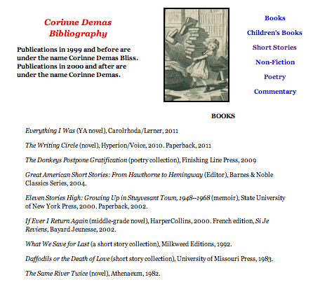
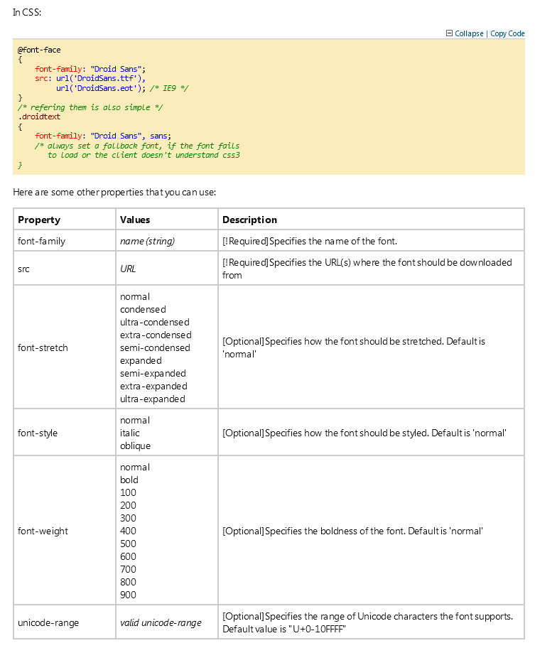
Do you know which page style best benefits your web site? Have u ever considered a single page web site, or has a multi page site been the only thing t can be one of the most interesting and cool web sites that you can find.
For this blog I will be comparing “Team Geek” http://www.teamgeek.co.za/#whob and “Every Last Drop” http://everylastdrop.co.uk. These web sites both use the single page concept very differently. They each have a unique approach that best reflects their individual message.
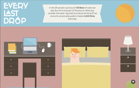
EVERY LAST DROP
FIRST SIGHT
When I first visited “Every Last Drop” (http://everylastdrop.co.uk.) my first impression was that it looked interesting. I was surprised that I did not see a navigation bar and I thought maybe the image was the homepage and but then I after I saw the sign that said scroll down I thought umm maybe the navigation bar is a little further down the page. When I fist started to scroll down I was wondering why the page wasn’t going down then I was chocked when I saw the illustrations begin to move.
NAVIGATION | SCROLLING
“Every Last Drop” does not have an average navigation bar like other web sites do. Instead of getting different tabs with options of what information you want to read out or go directly to, you get the option of scrolling down.

You have two different ways of scrolling through the page; you could do it manually at your own pace like any other web site with your mouse. When you choose to use your mouse to scroll at your own speed you can get rough the site a lot faster while still getting the bits of information scattered trough out because even when u have the option if speeding trough it you still don’t miss any information because you want to see the transitions as you go further down the page. Or you can use their scrolling system, which consists of this little arrow at the bottom right side of the page. Once you click it the page will start to move on it’s on and take pauses where information can be found. If you choose to use the arrow while the page is still moving the arrow disappears.


INFORMATION
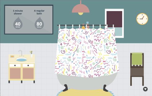
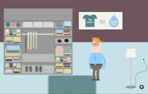
The information found in this site is in small portions and it is very well distributed trough the single page web site. It not only contributes to the story being told by the illustration but it gives valuable information at the same time.
Most of us would do anything to get out of a boring presentation about why we need to conserve water, and if you are or have a child they are bound to get restless or bored and not pay attention to the information being given to them. But what this web site does is that it delivers the same information in a fun interactive way that doesn’t make you feel like you are getting a lecture and it is perfect for both adults and children alike.
Because the information is also being given to you in small portions rather than large paragraphs or pages of context it again makes it easier to not only retain the attention but to really take in.


ILLUSTRATIONS
As humans we tend to be visual people, especially as a child. When we see something at work rather than just being given facts we feel a more personal connection.
Most websites consist of imagery and small batches of information like “Every Last Drop”, but what is really interesting about this web site in comparison to others is that instead of getting just plain images or static illustrations that depicts the different information, you get this interactive experience as you get to see the daily life of this character that has been created just for us.


DESIGN
The design of this web site is a cleaver one. I think the use of the same color scheme through the entire website was a smart idea. It makes everything look unified and allows a better transition from one part of the story to the next.
The pink, brownish color used trough me off at first. It seemed weird but maybe its supposed to represent the unclean water?
The section at the very bottom of the page could use some revision. While the information trough the site is thoughtfully placed and flows as the illustrations change and the story unfolds, then you reach the end and it seems like it doesn’t quite belong. While before everything was proportionate to each other we now have very disproportional. The adds are all over the place.


TEAM GEEK
FIRST SIGHT
When I first visited “Team Geek” (http://www.teamgeek.co.za/#whob) my first impression was that it looked very symmetrical and that it didn’t really look like anything out of the ordinary. Just seemed like a normal web site, like any other.
NAVIGATION
“Team Geek” like other websites has its navigation bar at the top, with different sections u can go to. One thing that is cool is that rather than just having the words on the navigation, you have the icons, which once you move your mouse over them it changes from the icon to the name that was given to that section. It makes it more fun and really interesting, this is also something not to many web sites do.
![]()
![]()
![]()
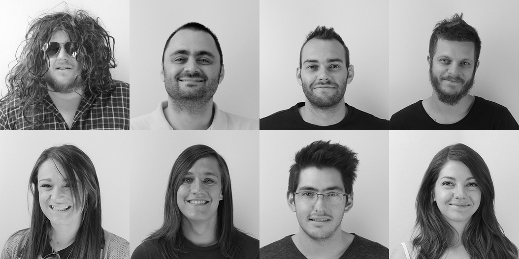
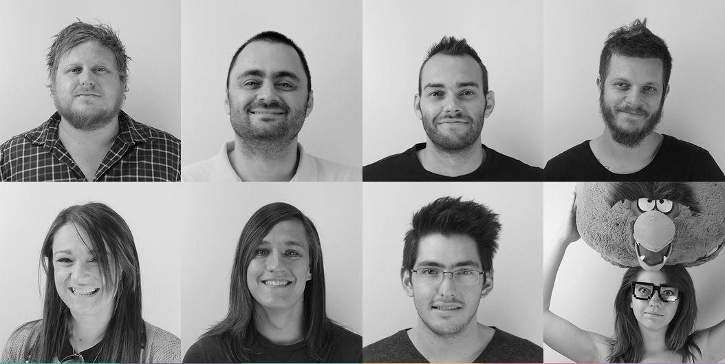
IMAGES
In this web site we can find both illustrations and photography. The illustrations are simple but well made, and add to this sense of this web site revolving around technology. Then you can also find photography when you get to mean the team. I think it’s a good thing that they used photography rather than an illustration for the team introduction because this makes it more person, it is easier for people to feel a connection and therefore will be more like to visit the site again or use their business.

INFORMATION
This web site is not very big in information. There are some small acts here and there, but no large body of content which in this case is a good thing because on line people don’t like reading to much at once and keeping information in small amounts like that helps keep the visitors attention.


DESIGN
It uses clean simple lines and sans serif typeface that goes well with the content. The colors choices are very light and are used consistently trough the entire site that keeps everything consistent.
One of the best features of this website is that when you move the mouse over the icons found at the navigation bar, a new color box slides in from top to bottom and you can read what that tab is about. This also happens with other icon trough the site only rather than the new box coming from the top it moves in from the bottom up.


The photographs of the team members use a similar solution, although instead of a color box sliding in with information about them, the photograph morphs from a series shot to a funny one. This helps add a nice fun environment to the web site.

MILEY CYRUS
FIRST SIGHT
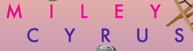
When I first visited the web site for Miley Cyrus I was surprised at how it looked. It is a mess, nothing really looks like it was placed with thought and it is just everywhere. Although I know that this was purposely designed it still does not look that good.

NAVIGATION
The navigation bar is very hard to find at first because the name place is below the navigation bar and it is just floating text, with images all around. When you more the mouse over it you get a white color box but when u go into a new tab it does not tell u anywhere, which tab u, are on and the white box that was in the navigation bar disappears.


In the news page there is a little bear that has a word bubble saying 1 of 2 and then when u hover over the bear the curser turns into a pointing hand which I so you know to click on the bear to go to next page.

IMAGES
There are lots of images found placed all over the page. Some are cutouts, others are whole, and are accompanied by stick on that where added. There is some animation found but it’s very few.


INFORMATION
Information is found very lightly trough the website. There are only tree tabs found, including the home page so information is very limited.
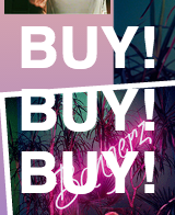
The home page includes the nameplate, a section to add to the mailing list, which is barely visible, and a section to the left, which says, “BUY! BUY! BUY!” which does change colors when you go over it, but there is no other info. Both news and tours seem to have the same information and it is very limited. There is really not a lot to look at.


DESIGN
I’m sure that there was some thought process when this web page was designed but it feels like someone just trough a bunch of photographs on the page with some simple type and called it a day. Everything is all over the place and is distracting, overwhelming and makes me feel a little claustrophobic.
There is so much stuff every where that even some of the cool little things like the teddy bear that leads to the second page of the news gets lots because everything is so crowded and stuff is so hard to locate.
HOW WOULD A ONE PAGE DESIGN BENEFIT YOU?
I think that a one page design would benefit Miley Cyrus because she wants something different out of the norm, which explains why hers looks all over the place right now, but a one page design is also something that is not often used. She also does not have that much information in her site and so a single page web site would help get things organized just as well as a multi page site.
WHO DID IT BETTER
I think that both “Every Last Drop” and “Team Geek” web site utilize the “single page” concept very well; they just do it in very different ways.
“Team Geek” utilizes a more traditional single page concept. It has a navigation bar like any other web site and even thought each section relates to the other.
“Every Last Drop” utilizes a less traditional single page concept. The web site as a whole, tells a story. Its like watching an animated movie but slower.


Recent Comments