
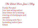
When you first see the website you will find Jane Green’s photograph to the left, under it you get “The Latest From Jane’s Blog.

In the middle you will find an advertisement of her next book. Right under that you have reviewer quotes, which are constantly changing.
LEFT NAVIGATION
The website consists of two different navigations, one vertically located to the left and the second horizontally at the top right.
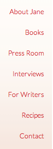
The navigation bar to the left consists of the following sections;
About Jane, a brief overview about Jane and her work.
Books, here you can find a short synopsis of the book as well as the book cover for both the American and England versions.
Press Room, you can find a list of blogs with links to it.
Interviews, all the interviews of Jane Green, including videos.
For Writers, she gives advice to future writers, tips, agents and writer blocks.
Recipes, you can find recipes on appetizers, meat, fish, vegetable including vegan, and sweet stuff. Maybe the reason for this is for when you have a get together or a book club, but I am still a little confused as to why this is part of the website since she does not write cookbooks.
Contact, you can leave comments/messages, you can send your email to be included in Jane’s mailing list for exclusive offers, sneak previews and the latest news, another link to her personal and official fan Facebook page, and Twitter. Contact information on her representative, Requests for Speaking Engagements, Requests for Press and Interviewing Opportunities, Book Clubs/Reading Groups, and Autographed Book Plate.
ABOUT JANE

In the About Jane section of the website we get a brief overview of Jane’s work and life, along with a small picture at the top right side with the text surrounding it. The body text is broken up into smaller paragraphs which makes reading larger information easier. The title is written in a cursive typeface that is very different from the body text and adds contrast to the page which it highly needs, since there isn’t much contrast.
BOOKS

In the Books section of the website you can find a short synopsis of the book as well as the book cover for both the American and England versions. Again we see the same body text broken into paragraphs and the cursive typeface for the headline. The addition of both the US and UK book covers was a good addition this way people know what they are looking for rather than looking for a book cover that they would not find in their country if the one displayed is for a different country.
PRESS ROOM

In the Press Room, you can find a list of blogs with links to it. But I am confused as if this blogs consist of bloggers that have in some way talked about Jane and her books, or are they just blogs of aspiring authors. And why do only the top three get an image? Is it because they are the best, or it is because they deal with a different topic that is more important?
INTERVIEWS

In the Interviews, all the interviews of Jane Green, including videos. As you can see the typeface used for this section is a sans serif unlike the rest which have an elegant cursive for anything that is not body text, so why is this page not the same as the others? I think it need to be the same as the rest so that the entire website feels coherent and flows nicely from one place to the next.
FOR WRITERS
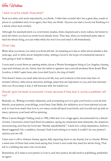
In the For Writers, she gives advice to future writers, tips, agents and writer blocks. The design in this part is a little better. We have the body text broken up into sections using questions each with its own subheading. This not only helps break up the information but it also makes reading the information a lot more comfortable.
RECIPES
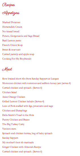
In the Recipes, you can find recipes on appetizers, meat, fish, vegetable including vegan, and sweet stuff. Maybe the reason for this is for when you have a get together or a book club, but I am still a little confused as to why this is part of the website since she does not write cookbooks. Here like in the For Writers page you have subtitles but the typeface used for the title and the subtitle are both the same and they are also the same font size. There needs to be some hierarchy added because right now is applied.
CONTACT

In the Contact, you can leave comments/messages, you can send your email to be included in Jane’s mailing list for exclusive offers, sneak previews and the latest news, another link to her personal and official fan Facebook page, and Twitter. Contact information on her representative, Requests for Speaking Engagements, Requests for Press and Interviewing Opportunities, Book Clubs/Reading Groups, and Autographed Book Plate.
TOP NAVIGATION

The navigation bar at the top consists of the following sections;
Home
Blog, where you can read Jane’s blogs.
Calendar, here you can find information regarding different events.
Twitter, you are connected to Jane’s Twitter.
Facebook, you are connected to Jane’s Facebook.
BLOG

In the Blog, where you can read Jane’s blogs. Here you get all the blogs one after the other. On the top we can see the blog title, followed by the date, and then title, location, link, and a description. In some cases after the description we see and address and ticket prices included. You don’t read the blog itself until you click on the link. At the bottom you can leave a comment or like it via Facebook and Twitter. The hierarchy in this case was use but it can be further pushed with some graphics, or maybe even different typefaces to give a different visual appeal to the page.
CALENDAR

In the Calendar, here you can find information regarding different events. As you can see we get an actual diagram of the calendar, but all the events are written on the bottom in a list form. Although I am not saying its bad to have the events on a list because the amount of information would not fit into the boxes or it would be extremely hard to read but I expect to see something on the calendar above, even if its just the number on a certain date that is bigger so that i will want to scroll down and so find out what is the event that day. As of now when I see the calendar completely empty my reaction is that it is either not working or that there is nothing at all that month,
TWITER

Jane Green’s Twitter.

Jane Green’s Facebook
INFORMATION AND ORGANIZATION
The content of the book is very well organized but I believe that it could use better design.
IMPORTANT IN THE HOME PAGE
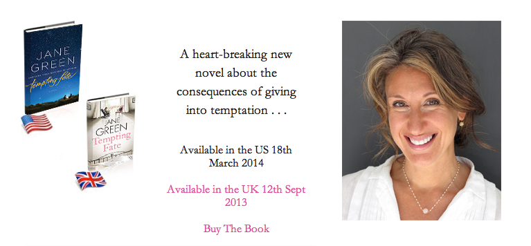
I believe the most important part of the home page aside from the authors photograph is the advertisement of her next book. You find information of when the book will be released in the US and UK, as well as the option to buy the book along with a short sentence giving u an insight on the books synopsis.
DESIGN
The design on the site is not completely hopeless but it definitely needs some revision. I think it needs some hierarchy on the inner pages, and it could use a different typeface that is more readable for the headings or it needs to be made larger, so that it becomes more readable.

Corinne Demas like Jane Green also writes fiction stories.
http://www.corinnedemas.com
INFORMATION AND ORGANIZATION
![]()
As you can see Demas website consists of a lot of information each with its own tab.
WRITING FOR ADULTS
First we have For Adults, which has a heading of Writing for Adults. It then has five links, Books, Short Stories, Commentary, Poetry and Plays.

BOOKS
Under the tabs you get a little overview on how many books the author has written and published, followed by articles related to writing. Directly after we have a series of books they include the cover and book title and publication right next to it. The way in which the books are displayed it not bad but they could used maybe a border or something to add more contrast to the page. The typeface being use could be changed for a different one that would better suit the page as well as bring in more contrast and hierarchy to the design.

SHORT STORIES
The Short Stories link takes u to a list of short story names but aside from a handful they have no link to read online and have no information as to where to guy them. It seems a little pointless to tell me about all this short stories and not give any information on where to find it. The page definitely need some contrast and hierarchy and a different choice of typeface.

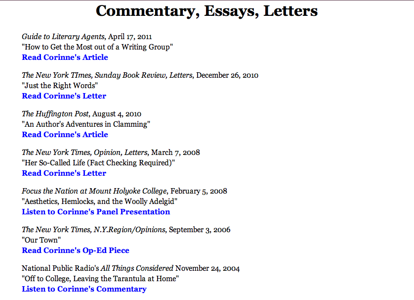
COMMENTARY
The Commentary link take you to Commentary, Essays, and Letters, where you can find a list of articles and other writings that deal with writing, reviews, among other things. I am not sure of the articles found here really relate to the Demas books specifically or if they deal with writing. They do include a link which is a good thing so if one catches ones attention they will be able to better explore it.
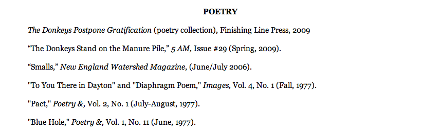
POETRY
In the Poetry link like the Short Stories link takes u to a list of poems but they also have no links or any information on where to find them.
PLAYS
In the Plays link you get to the plays that Im not sure if they will be coming out or have already appeared. Also the content does not even show in the window properly, which looks like a last minute addition that was not done properly.

FOR KIDS
We again have a little short bio of Demas and right after we have novels with the book cover, title, and publisher.

EVENTS
Centered list of events, there are some photographs after the list for some events. The centered text looks very tacky and its very difficult to read the information about upcoming events when it is presented like that.

IN THE NEWS

BIO
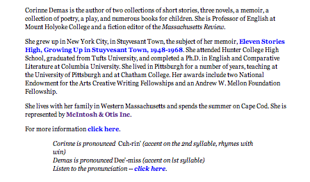
Finally we have made it to the authors bio, but we have been reading small versions of her bio throughout out previous tabs. I think they need to fix it so there is only one bio not three different ones in different pages.
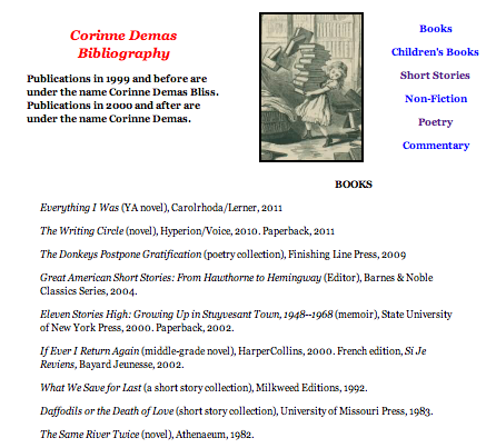
BIBLIOGRAPHY
The bibliography is pretty long. I only included part in the screenshot. Im not sure if it is to list all of her books or different books. But since this website is meant for one specific author why have a list of so many others?
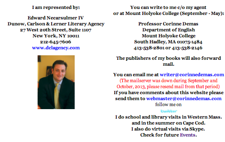
CONTACT
Again we have the centered text which makes it very difficult to read the information.
IMPORTANT ON THE HOME PAGE
The most important part of the home page is the information located directly after the navigation bar. I think this is important because it shows that there are books for all ages, from adults to children and it also advertises the new ones, which could increase sales specially for the fans that cant wait for a new book to come out.


Another author that also writes in the same genre, as Jane Green is Kathryn Stockett.
http://kathrynstockett.com.
BOOK
One of the coolest features of this site is that when you go into the book tab you can not only read the entire synopsis of the book but you can see all of the different book covers made for it by moving the little dot right to left which will make the books cover you want to see come closer into view.

BIBLIOGRAPHY
Here we can read a small bio about the author. She keeps it sweet, simple, and to the point.

EVENTS

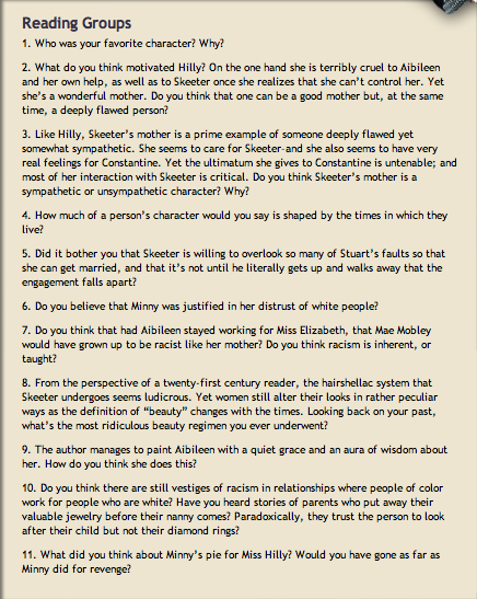
READING GROUPS
In the reading groups you can see a variety of questions that you can use in order to form your own reading group and get the talking flowing. You can follow, it or use it as a starting point for the conversation and analyzing of the book.
PRAISE AND REVIEWS
Here you can see the many different praises and reviews that this book/author have received. There are links available for the videos, I just wish it was the same for the articles.

MAILING LIST

CONTACT

IMPORTANT ON HOME PAGE
The most important part of the home page is the photograph of the book with the quote above because this entire site is dedicated to this one book, and not only does it promote the book it also promotes the movie that was made about it by Dreamworks.

PUBLISHER: BROADWAY BOOKS
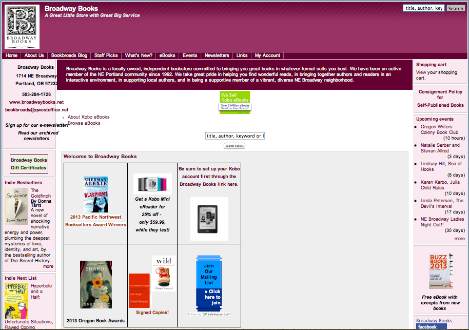

DIFFERENCES
One of the main differences between a publishers website and tht of an author is that a publisher website includes many different books of different authors. It also have information about many different people, and staff members.
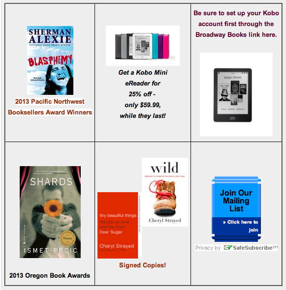
IMPORTANT ON THE HOME PAGE
The most important element in the home page is the section where you can find the contact information. I had a hard time arriving at this conclusion because there is so much going on the home page. It is very overwhelming when you first visit the site because there is so much fighting for your attention. I decided the contact information is the most important. Although it is found at the bottom of the page so it should not be places so low.

OTHER CITES

http://www.cssdesignawards.com

Leave a comment